

Redesigning a website – How to craft a new digital identity for your brand
Is it time for your organization to consider a website update? Learn about the method and experience the Center for Digital Strategies at Tuck School had with their site and brand redesign and refresh.
Redesigning a website is a big undertaking. No one will dispute that. There are developers and project managers and your internal team. Plus partners, and family members, and mentors. People have different ideas- sometimes people agree, sometimes they don’t. Sometimes everyone agrees but the functionality is impossible due to constraints like budget, timeframe, etc.
In 2016, the Center for Digital Strategies at the Tuck School of Business (CDS) team went through a website redesign. It was something we had put off for a bit, but the time was right, the team motivated, and so we took the plunge. We thought we’d share some of the steps we took in the hopes they help others looking to make an intentional and strategic change to their digital presence.
Review
Our first step in the process was a review of the current Center for Digital Strategies website (for clarity we will refer to this past site as v2010, and the new site we released in January 2017 as v2017). The core team of the Center is small, and everyone was involved, from Faculty Director to undergraduate intern. We all agreed that the site did not have the aesthetic we were looking for. It was outdated and obvious about it.
We provide several different types of programming, the majority of which are those aimed at executives, and those available to MBA students on campus. These talks, conferences, etc. result in a lot of content that we upload to our site: case studies, videos, podcasts, presentation decks, photos, etc. However, in v2010 one accessed the content through the Event page. While there was a search function on the site, it was not clear how new users could easily be introduced to a topic. We needed to review the Structure of the site.
It was decided that registration to events should be simplified. A registration functionality would be developed to allow users to easily input their name and email, and get an appointment for their digital calendar sent to them. This would make registration easy for users, and provide our team with a list of attendees for each event. Similar forms were created to help us populate our Newsletter list and grow our contacts.
We reviewed how the site reflected the overall Tuck School of Business brand. The primary Tuck website is very current, and had recently had a homepage refresh. We wanted to reflect that overall aesthetic, but give our site a little bit of the CDS’s individual personality. We decided it was prime time to conduct a rebrand. Something new, clean, that would work with v2017. (Our web developer also designs logos, and worked with us on the new logo-highlighting our tech personality through subtle call outs to coding characters and pixels.)
While we had these internal discussions we also sent an RFP to web developers across the country. We had some great proposals come back, and finally decided to work with Kline Interactive out of Phoenix, Arizona.
Design
To go along with our new logo, we discussed the aesthetic or look and feel we wanted the site to have. This was both an internal discussion and open discussion with our web developer. We agreed that we wanted something along the lines of: clean, simple, clear, light, modern, subtle animations. While we wanted the site to appear “cutting edge” we also knew we did not have the budget or bandwidth to update the site every year. We would use less animations or trendy accents (no matter how cool they looked!) and stick to our simple and clear idea.
To take advantage of up to date plugins and tools, the site was moved from Expression Engine into WordPress. Our web developer’s team handled the content migration, which was a significant undertaking given we had 10 years of content to move over.
Structure
One of the largest changes to the design of the website was the structure, and how the user interfaces with the site. For example, say you are interested in new trends relating to Internet of Things. On v2010 you would search for “Internet of Things” and a long list of content would display, you could scroll and click through. If that wasn’t quite what you wanted you could search again or go back. With v2017 we decided to create a structure that would not only allow users to sort and filter through content more easily, but also highlight our areas of expertise.
Subject matter & “areas of expertise”
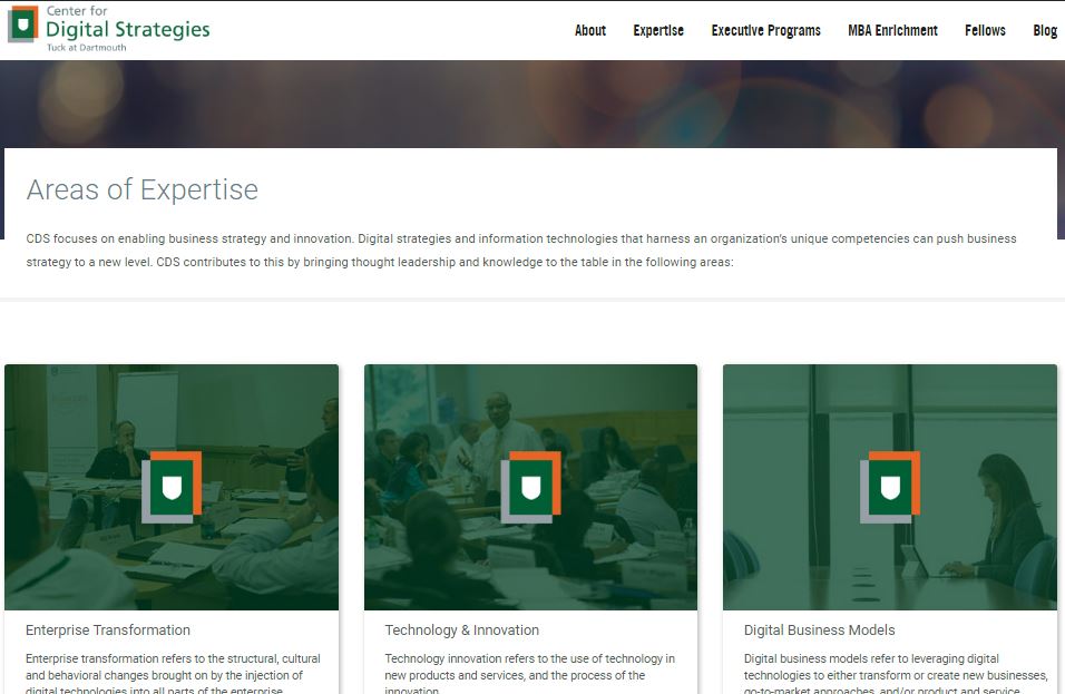
We started with a deep dive with our internal team to identify 3-5 buckets that were the topics most of our research and programming focused on. The results of this conversation become our “Areas of Expertise”. We then reviewed the (hundreds) of categories we had tagged content on the back end as and reduced to under 30. Some tags were deleted as they were duplicitous, very closely related, or just outdated (think “3g Networks”).
The website opens with these topic areas, and content is organized within them. We still needed to display our programming and events, but this was now secondary to the thought leadership we wanted to share. An events section was made to show chronologically upcoming events, and past events are shelved in sub navigation. This flip also made us think hard about what type of material to showcase on the site.
At first we kept with the old way of thinking, and the homepage Features showcased a Britt Technology Impact Series event, a Roundtable event, and a recent research article from one of our faculty. While reviewing for launch we realized that actually we wanted people to watch the video of the Britt event and gain insights, not learn about an event that happened last Fall. Same for the Roundtable, we wanted people to read the insights that our roundtable members shared, not the information of where and when and who. This was an entire mindset shift for the team.
Conversion
To prepare for the new site, we decided to set up a content audit. Luckily, we had a couple of undergraduate interns who were a whiz at taking this project on. We developed a Google Sheet that the entire team had access to. The different sections of v2010 were set as different sheets, and these were assigned to different interns.
Columns were constant across all sheets and went as follows: File/link, Content, Type (mp3, PDF), URL, Points of Access (Web Path or structure), Last updated, Publication Date, Need to Update?. Duplicate? Primary Tag, Additional Tag1, Additional Tag2, Category 1, Category 2, Category 3, etc.
A sheet was set as the primary Dashboard. This is where we input the definitions of our new expertise buckets (Tags) and listed all of the Categories that would be on v2017. After the initial rundown of all content had been entered row by row into the audit, we were able to get a better grasp of how much content we were looking at migrating. We were also able to define how different pieces of content should be tagged and categorized so as to fit in the v2017 search and filtering system.
Our awesome interns went back in and worked backwards by date filling in the appropriate expertise buckets and site categories or topics. Once the content was migrated they were able to refer to this sheet when checking how topics had translated to the new site.
Cleaning and polishing
Before any marketing launch, you want to make sure that what you’re showcasing is ready to be drilled into. Given the wonderfully talented students, executives, and partners we work with, we wanted to be extra sure that the site was putting it’s best foot forward. The design and migration was complete in November; we decided to take the holiday season for our team to clean up and learn the new WordPress system.
A lot of scrubbing was done on the back end. When you haven’t updated a site in as long as we hadn’t-things change. Pictures are now much larger (screens are larger too…) headers and text translated in odd ways from Expression Engine to WordPress in a couple cases. Our team went back a couple years with static content, and polished our dynamic and core content. This was a team-wide effort, and a great way for users to learn the new system. It allowed us to catch some bugs and work with our web developer to get those fixed. We learned that there were certain policies to make around uploading and publishing content, image aspect ratio, shortcodes, etc.
While working through these things I compiled a Website Cheat Sheet. Everything that was getting fixed, all the little nuances for how to edit content or make widgets work, I plugged into the working document. The goal of the document? That a fresh team could come in and make sense of how to publish new content and update the website with little in person help. As we enter the closing stages of this website project, the document will be reviewed by the team and used to help train future interns and staff.
Read the entire blog as originally published on the Center for Digital Strategies website.
Read Part 2 -->